












Key takeaways
Milestone trend analysis (MTA) is a project-controls technique that plots a milestone's forecast completion date at each reporting period, turning a series of status updates into a trend line. A downward slope indicates slippage; a flat line shows a stable forecast; and an upward slope indicates an earlier forecast date. It's a fast way for project controls teams and schedulers to spot schedule drift early rather than discovering a missed deadline after the fact. PMOs apply the same logic at portfolio level to reveal broader slippage patterns. MTA complements earned value management and detailed scheduling rather than replacing either.
What is milestone trend analysis?
Milestone trend analysis is a project-controls technique that tracks how the forecast date of a milestone changes across successive reporting periods, so you can see whether it's slipping, holding steady, or moving earlier. It's sometimes called a milestone trend chart, or a milestone slip chart when the focus is specifically on delay. The technique has been a staple of project controls and scheduling teams for decades, precisely because it turns a pile of status reports into one line that's easy to read at a glance.
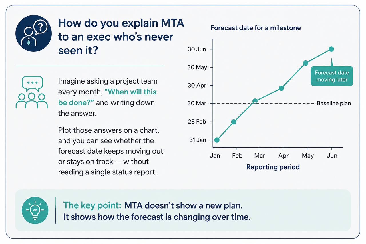
It's worth being clear on what it isn't. A Gantt chart shows the plan at a single point in time—what's scheduled, in what order, with what dependencies. A milestone trend chart shows how that plan has moved over time. One is a snapshot; the other is the direction of travel. You need both, but they answer different questions, while MTA shows whether the forecast is holding steady or changing over time.
How to read a milestone trend chart
This is the part that matters most: the horizontal axis (X) is the date of each review—this week, last month, the month before. The vertical axis (Y) is the forecast completion date reported for the milestone at that review. Plot one point per review, per milestone, and connect the dots. Each milestone becomes its own line, and the shape of that line is the whole analysis. Together, those lines form a milestone chart—essentially a milestone timeline that shows exactly when confidence in a date started to shift.
| Trend line direction | What it means | PMO action |
|---|---|---|
| Sloping down (towards later dates) | Milestone forecast is slipping | Investigate the cause, then re-baseline or recover |
| Flat / horizontal | Milestone is holding to plan | Monitor |
| Sloping up (toward earlier dates) | Milestone is pulling forward | Reallocate freed capacity; check quality wasn't sacrificed for speed |
| Crossing the diagonal "today" line | Milestone is now overdue | Escalate |
Most charts also carry a diagonal reference line running at 45 degrees, representing "today" at each review point. When a milestone's trend line crosses that diagonal, the forecast date has fallen behind the review date itself—in plain terms, the milestone is now overdue and hasn't been closed out.
Worked example: Say a milestone is reviewed monthly for five months. In January, it's forecast for June. By February, it's slipped to late June. By March, mid-July. By April, early August. Each individual slip looks small—a couple of weeks—but plotted together, the line makes the compounding drift obvious months before the original June date would have arrived and been missed. That's the entire value of MTA in one picture: it converts a series of "slightly late" updates that look forgivable in isolation into a trend that's impossible to ignore.
How to build a milestone trend analysis (step by step)
You don't need specialist software to start—a spreadsheet works fine as a milestone tracker for a single project. The steps are the same regardless of the tool:
- Pick the milestones that matter. In project management, the key project milestones worth tracking are the five to ten genuine decision points per project—not every task with a due date. Too many lines and the chart stops being readable.
- Set a review cadence. Weekly for fast-moving delivery, monthly for portfolio and steering-group reporting—just keep it consistent.
- At each review, record the current forecast date for every milestone, not just whether it's "on track."
- Plot forecast date (Y) against review date (X) and connect the points for each milestone into its own line.
- Read the slopes and annotate them—note what caused a slip or a pull-forward, so the chart carries context, not just direction.
The forecast dates usually come from wherever the milestone schedule already lives or a status update from the project manager. MTA doesn't replace that scheduling work; it's the analysis layer that sits on top of it and makes the trend visible.
Building this by hand for one project is manageable in a spreadsheet. Doing it consistently across a portfolio, reporting cycle after reporting cycle, is where the manual approach tends to break down—see how PMOs leverage SharpCloud views to track milestone trends.
The State of Capital Project Portfolios: 2027
Explore the 2027 state of capital project portfolios, including portfolio reshuffle drivers, prioritization strategies, visibility challenges, and a five-step framework.
Download now →Milestone trend analysis vs. other tracking methods
Milestone trend analysis is deliberately lightweight, and it's worth knowing where it sits next to the tools it's often used alongside—not instead of.
| Method | What it shows | Best for | Limitation |
|---|---|---|---|
| Milestone trend analysis | Direction of schedule drift over time | Early warning of slip, exec-friendly communication | Milestone-level only; doesn't touch cost |
| Gantt chart | The plan and its dependencies | Planning and sequencing work | A static snapshot; doesn't show how the plan is moving |
| Earned value management | Cost and schedule performance against baseline | Rigorous variance analysis | More data-intensive to maintain — see our guide to earned value management at the portfolio level |
| Burndown Chart | Remaining work over time | Agile and sprint-based teams | Tracks tasks, not milestones |
Scaling milestone trend analysis across a portfolio
A single milestone trend chart tells you when one project is slipping. It doesn't necessarily tell you why, or whether that slip is an isolated problem or the first sign of something systemic—a shared resource under strain, a supplier issue affecting several programs, or a risk that's already materialized elsewhere.
That's the question a PMO running 30, 40, or 50 projects actually needs answered, and it's difficult to answer from separate milestone charts and spreadsheets, each showing only part of the picture.
This is where MTA's logic becomes more valuable when combined with a connected view of the portfolio. Rather than looking at milestone trends in isolation, teams can explore how changes in delivery dates relate to the wider network around each project.
SharpCloud isn't a scheduling engine, and it isn't trying to replace the tool your schedule already lives in—the forecast and milestone data still comes from there. Instead, it can sit above those tools as a portfolio-wide visibility and decision layer, letting PMOs build the milestone trend views they need—such as percent-complete rollups, milestones plotted against a live data point, or flags for overdue work across programs—configured around their own reporting process. Once those views exist, SharpCloud brings milestone status together across projects and connects it to the risks, dependencies, resources and decisions that may be influencing delivery.
This allows teams to track milestone trends across a portfolio and see relationships between projects rather than treating each one in isolation. Those connections can then be explored to understand how a change in one area could affect others, helping teams see where projects may be heading rather than just where they stand today.
In other words, milestone trend analysis tells you a milestone is trending in the wrong direction; a connected portfolio view helps you understand what's driving that trend, and what else it could affect if nothing changes.
That broader perspective is particularly useful when priorities or assumptions change. Moving a project, resource or dependency in a connected portfolio view can reveal the knock-on effects across related initiatives, helping decision-makers explore the consequences before committing to a change. This is the difference between monitoring milestone performance and understanding portfolio trajectory.
If you're responsible for visibility across a full portfolio, our project portfolio management page and the guide for PMOs on intelligent decision-making across project portfolios go into this in more depth.
Case study: Seeing the bigger picture across a defence portfolio
A global defence agency used SharpCloud to connect complex programme schedules, infrastructure plans and cross-cutting functions into a single interactive view. By visualizing the relationships between timelines, risks and dependencies, the agency could anticipate the impact of events such as supply chain delays, identify gaps, and support high-stakes investment decisions. The approach helped identify more than £1 billion in missed opportunities and provided a clearer rationale for major infrastructure and investment decisions.
Limitations of milestone trend analysis
Milestone trend analysis is only as useful as the discipline behind it. The technique itself rarely fails—the way teams run it does.
Plotting too many milestones. The moment every task with a date gets a line, the chart becomes unreadable and the trend disappears. MTA's value is a fast visual signal; tracking 40 milestones instead of the 8 decision-critical ones erases that signal entirely.
Treating the forecast update as an admin chore rather than a real re-forecast. This is the most common failure mode. Someone copies last period's date forward because "nothing's changed," or nudges it slightly to avoid an awkward conversation. A flat line can mean genuinely on track, or it can mean nobody actually re-estimated. From the chart alone, you can't tell which—and that's exactly the risk.
Reading the slope but ignoring the why. Seeing that a milestone has slipped two weeks at every review for two months is not, by itself, an analysis. MTA shows you that something is drifting and roughly how fast; it says nothing about the cause. Teams that treat "we can see it slipping" as the end point rather than the start of a conversation just watch the same slip continue.
Letting the review cadence slip. Weekly, then three weeks skipped, then monthly again. The chart assumes evenly spaced reviews—irregular gaps distort the slope visually, making drift look faster or slower than it really is. The rhythm matters more than the frequency.
Using MTA as a substitute for cost and schedule rigor, rather than a complement to it. A milestone can look perfectly fine on a trend chart while quietly running over budget or sitting behind a broken dependency. MTA is a schedule-direction signal at the milestone level, full stop—it has nothing to say about cost, effort, or task-level float, which is exactly where earned value analysis earns its keep.
Re-baselining to make the line look flat. When a milestone slips, resetting the baseline so the trend appears to "recover" quietly erases the slippage history the chart exists to preserve. There's a legitimate case for re-baselining a genuinely re-planned project; there's a very different one for doing it to tidy up a status report.
Turning it into a blame tool. Once a downward slope becomes "whose fault is this" instead of "what do we do about it in the next 48 hours," people start managing the chart rather than the schedule—softer forecasts; quieter slips. The chart only stays honest if it's safe to show a slipping line.
Trying to roll it up across a portfolio in spreadsheets. MTA holds up fine for one project tracked by hand. Stretch the same approach across 30 projects in disconnected spreadsheets and the updates fall out of sync, the executive view is stale before it's even assembled, and any pattern that spans multiple projects—one delivery team, one supplier, one recurring risk—stays invisible because every chart lives in its own tab. The technique doesn't break at portfolio scale. The spreadsheet does—which is exactly the gap a portfolio-wide view like SharpCloud is built to close.

Nicky Clarke
Technology Copywriter, project portfolio and risk management specialist
Nicky Clarke is a freelance B2B technology copywriter with more than 11 years' experience creating content for enterprise software companies. Having spent over a decade leading content and communications for SharpCloud, she specializes in project management, risk management, and strategic decision-making—producing blogs, website content, e-books, and thought leadership that make complex concepts accessible, engaging, and relevant for business audiences.
Frequently asked questions
Milestone trend analysis is a technique for tracking milestones in project management by plotting the forecast completion date of key milestones at each successive reporting period, revealing whether they're slipping, holding steady, or moving earlier. It gives project controls teams and PMOs an early, visual signal of schedule drift.
Each milestone appears as its own line plotted against review dates. A line sloping toward later dates means the milestone is slipping; a flat line means it's holding; a line sloping toward earlier dates means it's pulling forward. A line that crosses the diagonal "today" reference line means the milestone is now overdue.
Milestone trend analysis (MTA) is a lightweight, milestone-level view of how the schedule is moving. Earned value management (EVM) is a more rigorous method that measures cost and schedule performance together against a baseline. Many teams use MTA as an early warning signal and rely on EVM for detailed variance analysis.
A spreadsheet or scheduling tool like MS Project or Primavera is enough for a single project. Tracking trends across an entire portfolio—and linking slippage to the risks and dependencies behind it—is where PMOs typically move to a portfolio visualization platform such as SharpCloud.
Match it to your existing reporting cadence: weekly for fast-moving delivery work, monthly for portfolio and executive reviews. Consistency matters more than frequency—the trend only means something if the review intervals stay even.
Yes, and it's where the technique earns the most value. The same logic—track each milestone's forecast date review over review—scales to a portfolio; the difference is rolling every project's trend into one view so systemic slippage becomes visible, rather than hidden across dozens of separate charts.