


Key takeaways
Data visualization is reshaping how qualitative researchers analyze and communicate their findings. By moving beyond dense, text-heavy reports, researchers can use tools like word clouds, text networks, and hybrid visualizations to surface patterns, challenge assumptions, and make their work accessible to broader audiences. NVivo's built-in visualization features support this shift—helping researchers go deeper into their data without sacrificing rigor or context. Done with intention and clear objectives, data visualization becomes a powerful tool for storytelling and impact.
Advances in data visualization are elevating qualitative research, enabling researchers to surface insights and communicate findings with greater depth and precision than ever before. Moving beyond traditional, text-heavy methods, innovative tools like NVivo empower researchers to go deeper into their data, uncovering patterns and relationships that challenge conventional approaches.
Qualitative research has long been constrained by dense, text-heavy reports that are difficult for non-specialists to interpret. But a growing number of researchers are turning to data visualization to change that—transforming complex findings into accessible charts, diagrams, and visuals that communicate meaning at a glance. With tools like NVivo, it's now possible to go beyond surface-level analysis and uncover patterns, relationships, and stories that text alone can't tell.
Jonathan Ikeolumba, PhD, a doctoral student and researcher from Lagos Business School, has explored exactly this—demonstrating in his research and presentations how visualizing qualitative data simplifies complex findings and makes outcomes more engaging for diverse audiences.
Watch Ikeolumba’s presentation at the Lumivero Virtual Conference, on-demand.
Breaking traditional research communication barriers with data visualization
Qualitative research often results in detailed, text-heavy reports that can be challenging for non-specialists to interpret—and when complex findings are difficult to communicate, their impact can get lost along the way.
That is often true from the start, especially when a common data collection method in qualitative research produces rich but unstructured material such as interview transcripts, focus group notes, and open-ended responses.
Data visualization offers a compelling way forward, transforming nuanced analysis into accessible visuals through charts, graphs, and diagrams. By leveraging these tools, researchers can communicate patterns in their data more clearly, making their work relevant and engaging across disciplines and audiences.
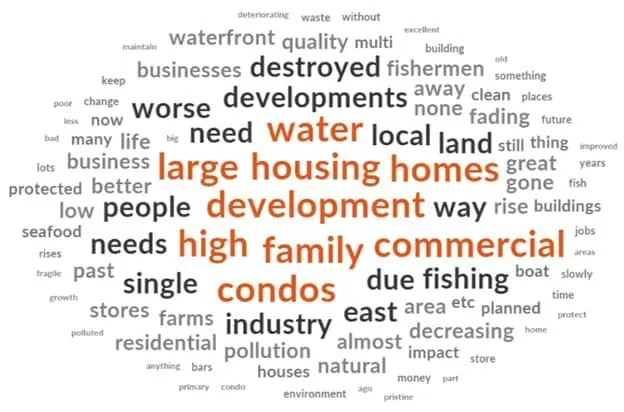
A word frequency chart example—helping to visualize the frequency of words or concepts within a text corpus, highlighting prominent terms and identifying key themes.
As Ikeolumba's work highlights, visualization also fundamentally enhances storytelling—making findings accessible to interdisciplinary collaborators or audiences less familiar with research methodologies. This ensures that research outcomes resonate across contexts, from academic conferences to policy briefings.
Techniques like word clouds, models, and word trees allow researchers to present findings in ways that are both engaging and revealing. Word clouds, for instance, surface the most prominent terms and key themes in a dataset at a glance, simplifying the presentation of core findings without losing meaning.
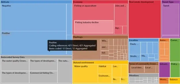
Beyond simplicity, visualizations enable researchers to delve deeper. Models in NVivo, for example, map connections between concepts, uncovering relationships that might not be apparent in text-based analysis. These tools allow researchers to challenge assumptions and rethink traditional qualitative data analysis methods.
Data visualization techniques explained
There are several visualization techniques that qualitative researchers can use to strengthen their analysis:
- Word clouds: Highlight the frequency of words or concepts within a text corpus, surfacing prominent terms and key themes at a glance.
- Text networks: Reveal relationships between words or concepts, supporting the identification of connections, overarching themes, and conceptual co-occurrences.
- Heatmaps: Illustrate the prevalence of certain themes or codes among various variables or time periods, identifying patterns and clusters within the data.
- Chronology charts: Visualize the chronological order of events, actions, or developments, analyzing temporal patterns and changes over time.
- Mind maps and concept maps: Organize and structure complex qualitative data into hierarchical frameworks, visualizing relationships between concepts and ideas.
- Flow charts: Depict processes, workflows, and linkages, making complex information more accessible and understandable.
- Narrative visualizations: Combine narrative elements with visual data representation to communicate ideas and conclusions in an engaging and intelligible way.
Challenges in innovating with data visualization
While data visualization offers transformative potential, it also presents challenges researchers should approach thoughtfully.
One key tension is the risk of oversimplification. A compelling visual can make findings feel more definitive than they are, stripping away the nuance and context that makes qualitative research valuable. The goal is always to enhance the analysis—not flatten it. Annotations, labels, and supporting text are essential tools for preserving the depth of the original data.
Another challenge lies in interpretation. Cultural and demographic factors influence how audiences perceive visual elements, which can introduce unintended bias. Colors or imagery may carry different meanings for different audiences. Researchers must be intentional in their design choices to ensure visuals are both accurate and broadly comprehensible.
How NVivo drives deeper insights
NVivo provides tools that allow researchers to break through traditional analysis barriers. By integrating data visualization directly into the qualitative research process, NVivo enables researchers to uncover insights that might otherwise remain hidden in dense textual data.
For instance, word clouds and word trees in NVivo highlight key themes and relationships in a dataset, providing a visual summary that reveals underlying patterns. These tools not only make findings accessible but also offer new perspectives on the data. Word trees, for example, illustrate the connections between concepts, helping researchers identify relationships they might have missed using text-based methods.
NVivo’s mixed-methods capabilities further enhance its impact. By combining qualitative and quantitative data, researchers can create hybrid visualizations that unify diverse datasets. This feature is particularly valuable for interdisciplinary studies, where integrating different types of data is critical to presenting a cohesive analysis.
Best practices for breaking the mold
To get the most out of NVivo's visualization tools, researchers should keep a few principles in mind:
- Start with clear objectives. Define the purpose of the visualization and understand your audience's needs before selecting a technique. This ensures visuals are meaningful, not just decorative.
- Preserve context with annotations. Use labels and notes to maintain the richness of the original data, ensuring visuals complement—rather than replace—textual analysis.
- Keep design intentional. Use consistent color schemes, avoid visual clutter, and resist the temptation to over-stylize. Excessive use of colors can overwhelm viewers—simplicity should guide design decisions.
- Leverage NVivo's training resources. NVivo's support materials and training options help users master advanced features, empowering them to push the boundaries of their research.
Rethink qualitative analysis with NVivo
Data visualization is a powerful way to challenge traditional methods and uncover new possibilities. NVivo equips researchers to break the status quo, enabling them to go beyond surface-level analysis and reveal deeper stories within their data. Tools like word clouds, word trees, and hybrid visualizations allow for innovative approaches that enhance engagement while preserving the richness of qualitative research.
Whether you're working on a dissertation, a policy study, or a complex interdisciplinary project, NVivo gives you the tools to make your findings impossible to ignore. Buy NVivo today to get started.