Better charts, better decisions: Avoiding the pitfalls of poor visualization
In a world awash with data, data clarity isn’t optional—it’s critical. For decision-makers and stakeholders, data visualizations are often the bridge between raw data and informed action. But not all visuals are created equal. Poorly chosen chart types, misleading axes, or visual clutter can distort meaning, confuse audiences, and damage trust.
That’s why accuracy, integrity, and thoughtful design aren’t just a nice-to-have—they’re the foundation of effective communication.
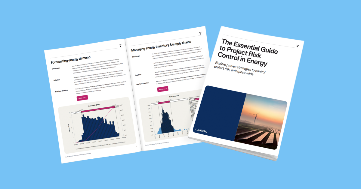
In this article, we explore why well-crafted data visualizations matter more than ever—and how to get them right. Plus, for a quick reference on what chart to use when, check out our eBook, “The Big Book of Data Visualizations,” showcasing data visualization examples of what you can create with Lumivero’s decision tools.
Data visualizations are central to decision-making
Visualizations do more than display numbers—they translate data into stories. Whether the goal is allocating funding, prioritizing initiatives, or evaluating outcomes, stakeholders rely on visuals to quickly grasp key insights.
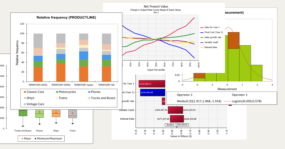
A well-designed chart can illuminate trends and relationships that might otherwise get buried in a spreadsheet. But when visuals are unclear or misleading, they can just as easily lead to poor decisions, misallocated resources, or misinterpreted results.
What makes a chart “good”?
A great data visualization communicates clearly and truthfully. It prioritizes communication over decoration. Strong visuals follow a few core principles:
- Clarity over clutter: Remove unnecessary elements. Simplicity aids comprehension.
- Use the correct chart type: Match the chart to your data structure (e.g., time series → line chart, categories → bar chart).
- Scale honestly: Don’t manipulate axes or scales to exaggerate effects.
- Highlight what matters: Draw attention to key findings, not distractions.
When visuals are clean, direct, and purposeful, they help stakeholders focus on what matters—and take action accordingly.
Accuracy is non-negotiable
Misleading visuals are more than just bad practice—they’re dangerous. Inaccurate charts can lead to incorrect conclusions, undermine trust, and damage credibility.
Common pitfalls that compromise accuracy include:
- Truncated axes that exaggerate differences.
- Cherry-picked data ranges that skew interpretations.
- Inconsistent units or baselines that confuse comparisons.
- Overcomplicated visuals that obscure the key message.
Accuracy in visualization isn’t just about the underlying data—it’s also about how that data is framed and presented. Even small design choices can either support or distort the message.
Visual integrity builds stakeholder trust
For many stakeholders, data visualizations are the first—and sometimes only—interaction they have with your analysis. That makes visual integrity critical.
When visualizations are honest and clearly presented, they help:
- Justify funding with credible evidence.
- Support confident policy or business decisions.
- Build buy-in for new initiatives by clearly showing impact or potential.
On the flip side, poorly designed visuals—especially those that feel misleading—can shake confidence in the data and the decisions built on it.
Best practices for creating data visualizations with integrity
Creating trustworthy visualizations doesn’t require complex design—it requires thoughtful choices. Here are a few data visualization best practices to follow:
- Always label axes, units, and sources so the viewer knows exactly what they’re seeing.
- Use color and size intentionally, not decoratively.
- Test your visual: Can someone unfamiliar with the data understand the takeaway?
- Avoid ambiguity by being clear in titles, legends, and annotations.
These small design choices go a long way in enhancing clarity and trustworthiness.
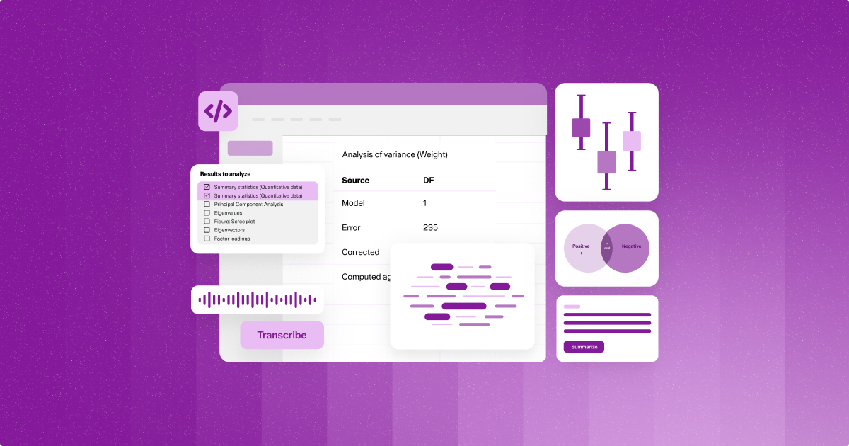
Tools that support visual excellence
At Lumivero, we understand that clear, accurate communication is critical for effective decision-making. That’s why Lumivero’s data visualization tools are designed with visual integrity in mind. Whether you’re forecasting risk or modeling complex data, our tools enable visual storytelling with integrity and allow you to support decisions with confidence.
Clarity, credibility, and confidence—one chart at a time
Clear and accurate data visualization isn’t a luxury—it’s a necessity. It empowers decision-makers to act with confidence, fosters trust among stakeholders, and ensures that insights lead to meaningful impact.
Before you send your next chart, ask yourself:
Is it clear? Is it honest? Is it helpful?
If the answer is yes, you’re not just sharing data—you’re driving better decisions.
Ready to create presentation-worthy visuals?
Explore how Lumivero’s data visualization software can help you transform complex data into clear, actionable, and visually compelling insights. Download the “Big Book of Data Visualizations” or request a demo today.