Using XLSTAT’s sensory analysis tools, product developers can turn overwhelming prototype data into meaningful sensory insights that highlight what makes each product stand out. Techniques like sorting, clustering, and PCA help uncover patterns, visualize relationships, and reveal key drivers of perception and preference.
Sensory research for product development moves fast—some labs process 20+ raw prototypes a day, making it hard to keep up. In a webinar for Lumivero, Iván Méndez, Founder of the Sensory Research Firm, MBSense, showed how using XLSTAT data analysis software can help expedite evaluation of prototypes so researchers can move to the next phase of development faster.
This article breaks down the key strategies: sorting, clustering, and principal component analysis—all supported by XLSTAT’s sensory-focused tools and designed to deliver actionable insights within a single workday.
Dig deeper into XLSTAT’s advanced techniques with the on-demand webinar, “From Chaos to Clarity: Accelerate Product Innovation with XLSTAT.”
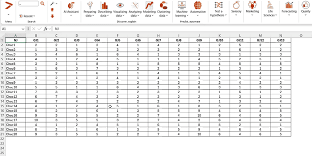
Sorting is a similarity-based sensory data collection method in which product judges taste all prototypes at the same time, then group samples according to how alike they are. Once a matrix has been created with judges’ scores, data analysis can begin. (Remember, XLSTAT data analysis software runs within Microsoft Excel.)
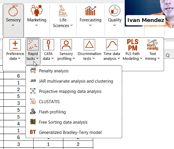
Choose the “Sensory” tab from the XLSTAT toolbar, click the “Rapid Tasks” menu item, and then select “Free Sorting Data Analysis” from the sub-menu. Choose the “CA” option in the window that appears to generate a correspondence analysis.
Once the analysis is complete, XLSTAT will produce a tab of results, which includes a multivariate observation graph, shown below.
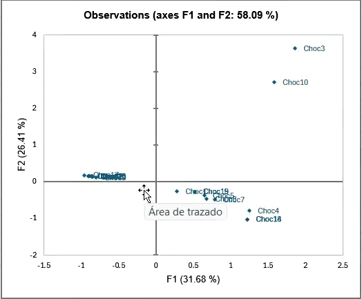
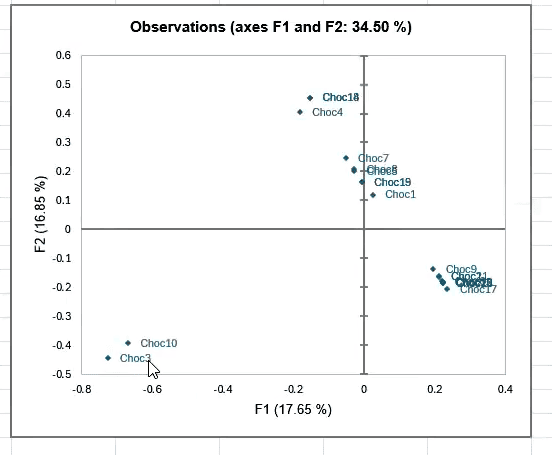
This observation graph plots the samples according to their relations to one another, and can help you begin the process of eliminating prototypes.
The correspondence analysis also produces results about your judges. In this observation graph, we see how the judges’ groupings compare to one another:
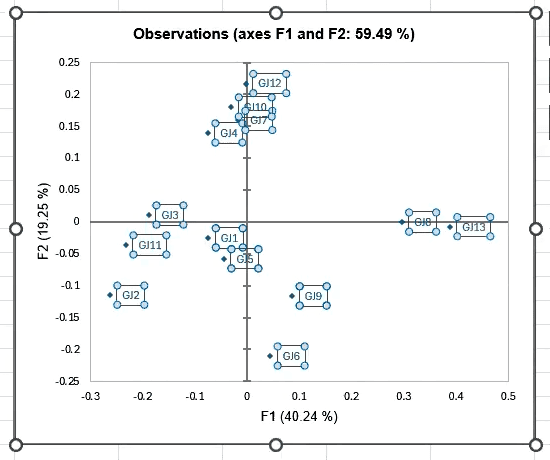
This feature helps you quickly determine whether any judges are outliers whose data can be eliminated from the group. Removing outliers helps to optimize the result file for your final report. In this example, judges showed a reasonable amount of variation in their responses, although GJ13 and GJ6 could be considered outliers if you were evaluating according to very strict standards.
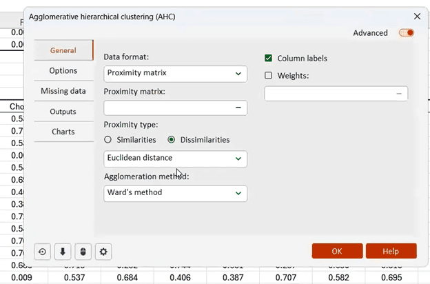
XLSTAT has a range of features that enable you to conduct quick, informative cluster analyses of your data. In this example, a proximity matrix was created from the correspondence analysis results. The proximity matrix shows the degree to which judges’ choices do or do not agree with one another.
The proximity matrix informs the next step, which is to run an agglomerative hierarchical clustering calculation.
The results tab generated by the cluster analysis will include another useful visualization—a dendrogram, which allows you to quickly understand how products were grouped by the judges as a whole.
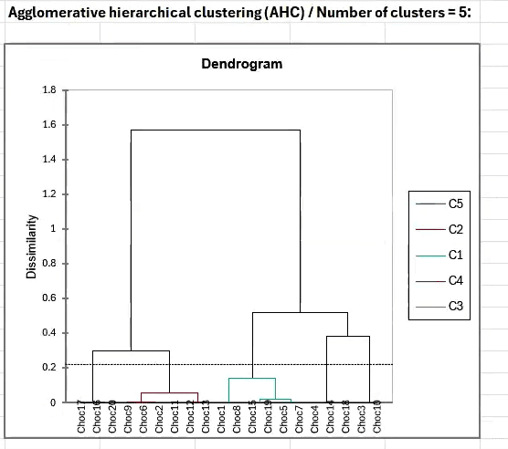
In this example, the analysis has identified five distinct product clusters.
It’s also possible to run a STATIS analysis within XLSTAT as part of your clustering strategy. STATIS evaluates multiple configurations of variables, then visualizes the links between those variables.
Once you have eliminated an initial round of product samples according to your criteria—for example, ingredient cost—it is time to conduct product characterization analysis.
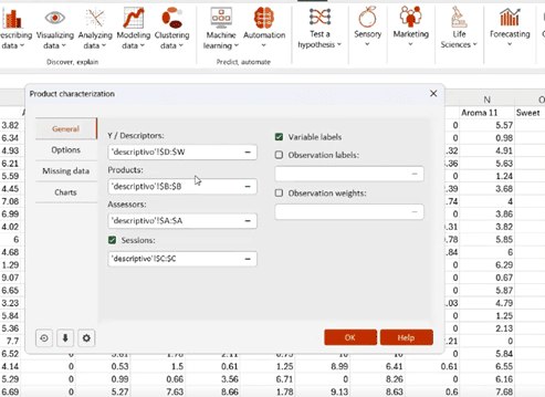
Product characterization analysis uses the analysis of variance model to detect which descriptive attributes apply to a set of products based on judges’ preferences. To conduct product characterization, you’ll need to have scores from the judges for each product sample. Scores can apply to different sensory attributes, such as taste, aroma, and texture.
The results tab generated by the product characterization will produce a range of tables showing relationships between products and their sensory attributes. (The analysis also produces tables evaluating judges and their sensory attribute scores relative to the main group.)

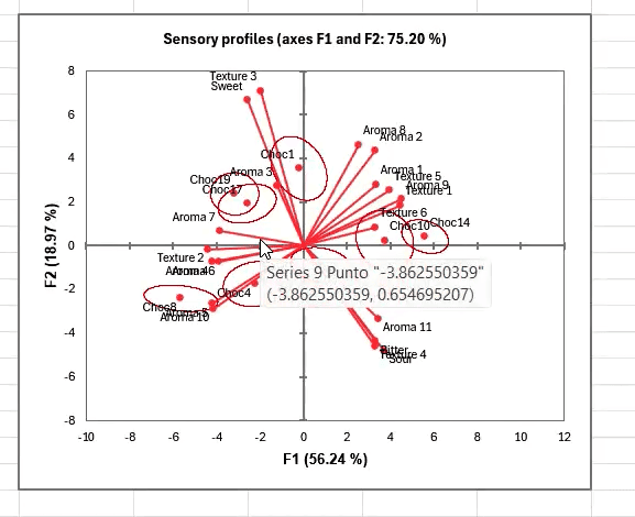
Product characterization outputs also include a sensory profile plot, showing each product grouped with its most distinctive attributes.
Once you have your data from your testing group, XLSTAT makes it possible to run all these analyses—sorting, clustering, and product characterization analysis—within minutes, helping you stay on top of your sensory research no matter how busy your lab may be.
Interested in more detail about the sensory data analysis techniques covered in this article? Watch the on-demand webinar, “From Chaos to Clarity: Accelerating Product Innovation with XLSTAT,” now or buy XLSTAT to get started today.